

Anime Expo App Redesign Case Study
By: Tyler Nguyen
Teammates: Jason Trinh and Sammy Ulloa-Ramos
Timeline: 3 months (April-June 2026)
Tools: Figma
Roles: UX Researcher and UX Designer
This project displays my COGS 127 group project in regards to the enhancement of the Anime Expo App throughout the 10 weeks. The project focused on improving navigation, scheduling, and coordination for attendees in a large-scale, while also keeping in mind the Business Impact a redesign could bring.
Overview
Motivation and Context
Anime Expo is one of the largest anime conventions in the United States, spanning four days of densely packed events, panels, and activities. While the experience offers high value anime-based experiences for attendees, it also demands significant time, planning, and financial investment.
Because of this, the mobile app should play a critical role in helping attendees navigate and make the most of the event. However, as past attendees, we and many others, notice a recurring issue. The app often fails to support that goal effectively through the in app schedules, maps, and overall UI.
User feedback reflects this . Some reviews describe missing event details beyond the physical schedule, while others report that the search function makes it difficult to locate relevant events. These issues point to a deeper problem in how information is structured and surfaced, particularly the lack of effective filtering, map features, and tagging systems for discovery.
In our opinion it should be an easy implementation to improve the quality of life of the app. The problems stated above show an easy oversight in the app. This would be important as it shows real-world experience and demonstrates how we saw flaws in the app’s UX design.
User Research
Interviews and User Findings
Interview Findings
Interview 1 — Anime Expo Attendee (since 2023)
This participant used the Anime Expo app primarily as a scheduling tool before and during the convention. They typically begin using it about a week before the event to browse panels and booths, even when they are not searching for anything specific. During the convention, they checked the app every couple hours mainly to confirm timing and adjust plans.
A key limitation identified was the difficulty of comparing events across different schedule tabs (ex. panels, autographs, ticketed events), which made planning less efficient for them. The participant often had to manually scroll through options rather than compare them directly in the app.
Overall, they felt the app had improved compared to previous years, but still lacked a unified scheduling view that would make cross-event planning easier.
Interview 2 — Anime Expo Attendee (since 2023)
This participant used the Anime Expo app mainly during the month leading up to the convention, when schedules are released. Usage drops significantly during the event itself, as they prefered to plan most of their schedule in advance.
They primarily relied on the schedule section and rarely use other features such as the map or built-in planner, preferring external tools like spreadsheets or calendar apps for organization.
While they described the app as generally organized and functional, they expressed that they would not use it as a primary planning tool due to limitations in usability and structure. Instead, they used the inm app information in tandem with tools like Google Calendar or Excel, which they find more flexible for comparing time slots and managing overlapping events.
User Findings
Across both interviews with attendees of the Anime Expo app, several patterns emerged in how users engage with the platform.
-
The app is primarily used as a scheduling reference tool, especially in the week leading up to the convention when official schedules are released
-
Users tend to browse rather than search, often scrolling through events without a clear target
-
During the event, usage is low, mainly to confirm timing rather than actively plan in real time
-
A major problem is the inability to easily compare events across different schedule categories, leading users to mentally track conflicts or switch between external tools.
-
Despite finding the app generally organized, participants frequently used external tools (ex. Google Calendar, spreadsheets) due to better flexibility and comparison features.
-
Overall, the app is seen as a useful reference but not a primary planning tool, especially for managing overlapping or time-sensitive decisions.
Business Impact
Why it matters
Anime Expo attracts over 100,000 attendees across four days, with hundreds of overlapping panels, events, and activities. During peak hours, users are often forced to make quick decisions between overlapping events across different halls. This requires constant cross-referencing of times, locations, and interests.
Our user research suggests that while the app is intended to support scheduling and event planning, many attendees rely on external tools or other workflows instead. This limits its role in real-time decision-making and planning.
From a business perspective, this gap reduces user engagement and retention within the app. This limits exposure to in-app announcements, updates, and sponsored content. Since sponsorship visibility is a key revenue driver for large conventions and booths within the convention, reduced app usage can indirectly impact sponsor value and long-term event funding.
Additionally, when users look towards other tools like Google Calendar for scheduling, the app loses its position as the central planning interface. This weakens its role as a hub for the convention experience, even though it still performs well in providing official updates, event listings, and general information. This shows if the app fixed small areas like the map and scheduling interface, it may become the premier app for convention attendees.
Large-scale conventions also present significant usability challenges, especially for first-time attendees. If the scheduling system is not intuitive, users experience higher cognitive load, leading to missed events, inefficient planning, and frustration during peak decision-making moments.
Improving the scheduling experience, particularly through clearer comparison and filtering of overlapping events, could reduce this friction. In turn, this may increase daily app usage, improve event discovery, and enhance sponsor visibility.
More broadly, a stronger and more intuitive app interface could allow the app to evolve from a static information tool into a core coordination platform for the convention experience, while also providing valuable behavioral data to inform future programming decisions.
Designs
High Fidelity Prototypes and Sketches
These three High Fidelity Prototype designs were created by myself. The image to the left shows dedicated notifcation and message buttons, which don't normally show up. These parts of the app would allow users to not only to share their schedules between one another but, would allow to have a dedicated spot to show announcements and changes in the convention.
The map interface adds a way to look inside the individual halls and sections of the convention. Usually the map only provides a static image, on the bottom half of the page. With this addition, you can now see different booths and more descriptive ideas of how the areas layout is.
The screen on the bottom shows the app when you click on the notification tab. It is meant to add a hub where both personally liked events and general announcements can be seen. You would theoretically be able to click on the announcement to get more details. The addition of the "X" and "Mark as read" buttons serves similair roles, where the "X" would delete in information while, "Mark as read " would remove the in-app notification bell mark.


Teammate Gallery
The Main High Fidelity Prototypes and Sketches, By Teammates
.png)
.png)
These sketch illustrations above and the high fidelity prototype of the filter system are the work of my teammate Sammy Ulloa-Ramos.

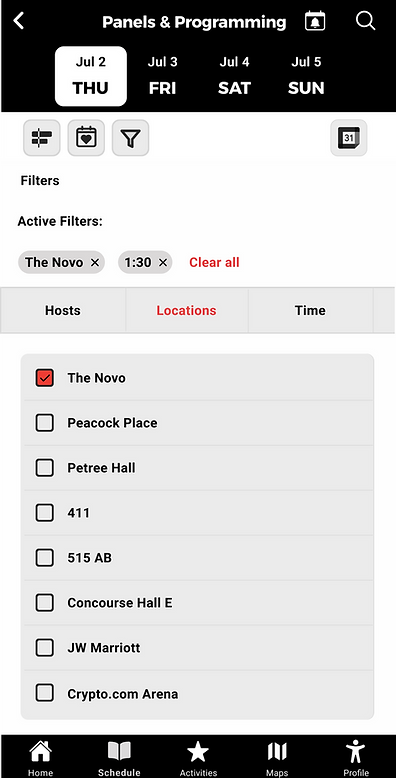
This high Fidelity prototype of the filter system is the work of my teammate Sammy Ulloa-Ramos. It functions as a way to filter between events when looking for panels, events, and programs. You can filter by hosts, time, and locations in order to maximize your time at the convetion and find what parts of it you'll enjoy the most.
This high Fidelity prototypes of the look into the Panels tab is the work of my teammate Jason Trinh. It functions as a way to find and scroll through the events planned. From here you can also export these events into your own Google Calendar Schedule, which can be seen below. The bottom left displaying adding multiple events to your Google Calendar, while the bottom right shows adding a singular event.


Alternate High Fidelity Screen Gallery
The Alternative High Fidelity Prototypes and Sketches, By Teammates and Myself


The alternate high fidelity prototype filter screens mabe by Sammy Ulloa-Ramos.


The alternate high fidelity prototype Google Calendar Export screens are mabe by Jason Trinh.

The alternate high fidelity prototype map screen was made by Tyler Nguyen.
User Test Results and Reflection
User Testing Methodology
To evaluate our Anime Expo app redesigns, our team conducted follow up user interviews with previous participants. During these sessions, participants were shown our Figma prototypes and asked to complete Anime Expo app tasks such as adding events to their schedule, filtering events by location, and finding exhibitor booths using the map. Because the prototypes were only partially interactive, participants verbally explained where they would click and what they expected to happen. We then walked through each redesigned screen and gathered feedback on usability, layout, usefulness, and overall impressions.
The purpose of this testing was to determine whether our redesigns improved the user experience compared to the current Anime Expo app while identifying any remaining usability issues.
User Testing Results
Overall, both participants responded positively to the redesigned app and found it easier to navigate than the current Anime Expo application. Participants were able to successfully complete key tasks without significant confusion, suggesting that the redesigned layouts effectively supported common convention-planning activities.
Several features received especially positive feedback. The filtering system was viewed as useful because it allowed users to narrow down events by location and time, making it easier to build a convention schedule. The Google Calendar integration was also highly appreciated because it simplified the process of transferring Anime Expo events into users' personal calendars.
Feedback regarding the map redesign was generally positive as well. Participants liked the addition of a floor-plan view and felt it would make locating vendors easier than using the current static map. One participant specifically noted that having a booth-level floor plan would be useful when searching for exhibitors. However, users also identified opportunities for improvement. The map could be difficult to interact with due to its size, the zoom functionality was not noticeable, and users wanted additional orientation information such as entrances, exits, and other landmarks to help them navigate the convention hall.
The notification system also received positive feedback because users appreciated reminders for upcoming events and notifications regarding schedule changes. However, participants emphasized that notification settings should be customizable to avoid unnecessary alerts.
Personal Reflection
The user testing sessions showed the importance of balancing functionality with discoverability. Although users generally liked the new features, some of the functionality was not immediately visible to them. This was especially evident in the map prototype, where participants appreciated the concept but struggled to notice zoom controls or understand how to orient themselves within the hall.
One insight I found particularly interesting was that users often rely on physical landmarks when navigating Anime Expo. While my original map redesign focused on improving booth visibility through a detailed floor plan, participant feedback showed that navigation also depends on contextual information such as entrances and exits This feedback helped me realize that an effective convention map should not only show booth locations but also help users understand where they are within the larger environment.
The testing also demonstrated that even features users may not personally use can still provide value to the broader Anime Expo audience. While some participants stated they would not frequently use notifications or scheduling tools themselves, they still recognized these features as useful additions that could benefit other attendees.
Before and After Stories

Before
When I initially redesigned the map experience, my goal was to provide users with a detailed floor plan that made it easier to locate booths inside the exhibitor hall. However, after reviewing user testing feedback, I realized there were still opportunities to improve usability. Participants noted that the floor plan appeared relatively small, the zoom functionality was not immediately obvious, and there was limited information available about individual booths. While the design improved upon the original Anime Expo map, users still needed additional support to efficiently navigate the exhibit hall and learn more about vendors.
After
Based on the feedback I received during user testing, I revised the map screen to better support attendee navigation and exhibitor discovery. I increased the size of the floor plan to make booth locations easier to read and interact with, while also moving and enlarging the zoom control so users could more easily recognize its purpose. To make the map more interactive, I added clickable booths that display exhibitor information directly within the screen. I also replaced the secondary map section with a dedicated information panel that provides details about the selected booth, allowing users to learn more about exhibitors without leaving the map page. Finally, I relocated the search functionality to the top of the screen to create additional space for booth information and reduce visual clutter.
Why I Made These Changes
My goal with this redesign was to transform the map from a simple navigation tool into a more useful convention-planning resource. User feedback showed that attendees wanted more than just a floor plan, they wanted a faster way to identify vendors and understand what each booth offered. By enlarging the map, improving discoverability of navigation controls, and integrating booth information directly into the experience, I aimed to reduce the effort required to find exhibitors and make the convention floor easier to explore.
I believe these changes make the Anime Expo app more valuable because they help attendees spend less time searching and more time engaging with the convention itself. The redesign also supports one of the core goals of the Anime Expo app: helping users navigate a large event efficiently while discovering content that interests them. While future iterations could further improve orientation through entrance markers and additional landmarks, the revised design represents a meaningful step toward a more interactive and user-centered map experience.
The three map variants can be seen below.
Left is orginal concept, middle is new zoom in, and right is normal new.


Before
The original filter screen allowed users to narrow down panels by categories such as Hosts, Locations, and Time. While the filtering system was functional, selected filters were not clearly visible once applied. Users had to remember which options they had chosen, making it difficult to understand how their current results were being filtered.
After
Based on user feedback, we thought redesigning the filter interface to improve visibility and filter management. We introduced an Active Filters section directly beneath the filter controls, allowing users to immediately view all currently applied filters. Each active filter is displayed as a removable tag, making it easy to identify and remove individual filters without returning to the filter list. The filter panel itself retains the existing category structure but now uses more prominent checkbox states to clearly communicate which options are selected. We also adjusted the layout by combining characteristics from both filters A and C.
Why These Changes Matter
One of the primary goals of the Anime Expo app is to help attendees quickly find panels and events that match their interests. As the number of available events increases, filtering becomes an essential navigation tool. However, users may lose track of which filters are active, especially when combining multiple criteria such as locations and times. By introducing visible filter tags and clearer selection states, the redesign reduces the cognitive effort required to manage filters. Users can instantly understand why certain events are appearing in their results and can remove unwanted filters with a single tap. This creates a more transparent and efficient browsing experience while maintaining the simplicity of the original interface. These improvements transform filtering from a hidden system into a visible part of the user experience, making it easier for attendees to customize their schedules and discover events that fit their convention plans.
Below is the full filter redesign.
%20(3).png)
Reflection
Project Reflection
Working and researching for the Anime Expo app redesign taught me the importance of user-centered design and iterative development. With the use of interviews and usability testing, I learned that users often encounter challenges that are not immediately apparent during the design process. Incorporating user feedback helped me improve features such as navigation, filtering, and event discovery, making the app more intuitive and efficient. And as a beginner in UX design, despite it being my 3rd year, I felt this project also strengthened my skills in Figma, prototyping, and UX research. Even just replicating the app, although not perfectly, felt really nice. If I were to continue developing the redesign, I would like to conduct additional testing with a larger user base and explore more personalized event recommendation features. Overall, this experience showed me how thoughtful design decisions can significantly improve the user experience of a complex event-planning application.